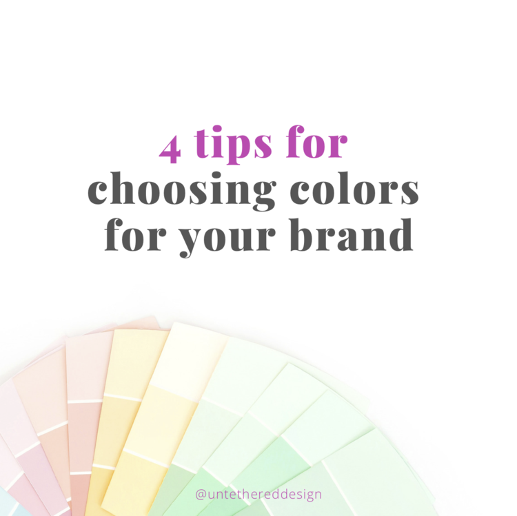
4 tips for choosing colors for your brand
Do you ever struggle with choosing just the right combination of colors for your brand, a client’s brand or an individual design project? There are literally countless colors that exist, in different shades and tints. Even just increasing the darkness or lightness of a particular color can change how it looks within a design, entirely.
How many should you even use? 2? 6? How do you piece together what works and what doesn’t? What do certain colors mean?
There is a ton of psychology involved with colors — and they alone play a huge role in your branding or any design project — because a palette is one of the aspects that someone remembers the most. It hits on certain heartstrings, can alter a mood and evoke a specific emotion, like happiness or anger. It can really set the overall tone for a design — like a logo, a website or a poster.
Today, I want to break down how to even begin in general when it comes to pairing a collection of colors together, to create a palette that looks really professional, attractive and timeless. It’s important to note that I’ve even seen lovely and successful brands that just use black and white. The secret is in simplicity, using colors that are visually-pleasing and therefore, memorable — along with considering emotions associated with individual colors.
Decide on 2-4 colors — It’s easy to get very overwhelmed when looking at all of the different colors that the world offers us. If you’re just starting out, stick with planning to choose a minimum of 2 or a maximum of 4 colors. For example, I’m sure that Target uses other colors within their official brand standards, but I (as a consumer) only think of two specific ones — red and white. And remember, you can always add more to your palette later, or if it’s for a brand, you can create a secondary palette that can be used in special circumstances. Extra pops of accent colors can always enhance a brand.
Consider your audience — Different people may feel differently about certain colors, but overall, there is a general science behind most colors. Keep in mind who you are communicating to or trying to reach. If it’s an entirely male-dominated demographic, you might not want to use pink and purple, as they tend to give off more of a “feminine” vibe, but you might try using a mix of blues, greens and greys. If your audience is something related to children (like a school program) you could play with colors that are more youthful and exude a fun, bright and youthful flair. If your audience is professionals in the wedding industry or brides, you could consider colors that are softer or more pastel-based — over ones that are bolder and harsher. These are just general tips to follow — of course, men can like pink and some brides use darker and moodier colors for their weddings. To each their own!
Consider emotion. On the other side of that same psychology coin, it’s important to think about how certain colors will evoke emotions, within a particular group of people. Colors have universal and basic associations to specific feelings, moods, thoughts and are big stimulants. The below descriptions might seem simple enough, but they’re crucial to remember. Again, think about not only WHO you are trying to attract, but also HOW your brand or design might make them feel, when they respond to seeing colors. Below is just a quick breakdown of a few, to illustrate what I mean:
Red: excitement, anger, energy, heat, loud, meant to grab attention.
Blue: corporate, professional, cool, peaceful, serenity, calmness.
Green: health, fresh, nature, environmental, growth.
Purple: bold, unique, royal, power.
Orange: similar to red, but on less of an “alert” or “anger” scale. More bright, fun, hopeful and positive.
Yellow: similar to orange. Youthful, happy, positive, cheerful.
Use online resources — I personally like finding inspiration in everyday things or out in nature. I even like going “old school” and taking a look at the Color Wheel to consider colors that are analogous, complementary, monochromatic and more. However, in the essence of time, it can also be quicker and easier to use a few handy websites that will automatically generate palettes for you. These are important when creating a few, so that you can compare them all and see what colors you like together and which ones that you don’t. Here are a few of my favorite online tools to use:
